Why I wanted to draw with ants
I wanted to make a piece of art that explores the complexity of software engineering. When I imagine a huge codebase, I think of its emergent complexity and tangled, inter-connected parts. Its overall shape, if it can be said to have one, emerges from the actions of many individuals.
I thought about how to represent this, and one image that resonated with me was that of the ants’ nest. Ants are a perfect example of emergent complexity. No individual ant is an architect, but together, they build beautiful, complicated structures.

I started by looking for information about simulating ants’ nests. Apparently there is literature about this, and it’s fascinating. But the trick was that ant nests emerge, in part, based on the physics of the sand and dirt they’re built out of – exactly how a particle settles when placed by an ant. I wanted to build something in 2D, and I wanted to get right into the simulation without writing a lot of sand-physics, which meant I had to scrap the physical ant-nest simulation.
This led me back to searching, and searching led me to an entirely different class of ant simulations: ant colony optimization algorithms.
Ant colony optimization is an agent-based algorithm used to solve for the shortest path between two points in a graph. Agent-based simply means it’s an algorithm composed of individual routines (in this case, the ‘ants’), whose emergent behavior solves the problem.
How it works is very simple. Each ant leaves a trail of ‘pheremone’ along the path it walks. Ants leave one kind of pheremone after they leave the nest, and a different one after they find food. Ants looking for food try and find a trail of ‘food’ pheremone to follow, and ants looking for the nest try to follow the ‘home’ pheremone.
Ants that happen along a shorter path will be able to make the round-trip between nest and food faster. That means they’ll lay down a denser layer of pheremone. Ants arriving later preferentially follow the denser trail, and they will take this shorter route. Each individual ant works with very simple rules, but over time, the ants will find a better path between the two points.
The Simulation
I wrote my ant simulator in Processing 3. I started my implementation by emulating the code in this great blog post by Gregory Brown.
Once I had the ants moving, I started to expand and modify the code to work better on larger grids of pixels. I wanted interesting looking simulations – not necessarily effective ones – which guided how I iterated the simulation. I added very rudimentary ant vision, so that each ant could look a few pixels ahead. I added ant death and ant respawning, to keeps the ants from loosely diffusing over the entire space. Finally, I made the ants a little dumber: they would leave pheremone constantly, even if a search is unsuccessful, which is similar to real ant behavior.
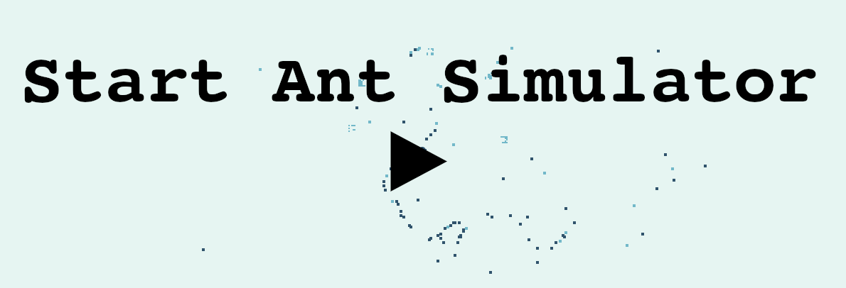
You can play with a p5.js port of the simulation in your browser here!
You can also take a peak at the ported source code on Github.
What fascinated me about this simulation are the lovely, weird, and complicated shapes that the ants made. They don’t march in straight lines, but start to form loops, whorls, and branches. Even more fun, you can control the sort of shapes the ants make by altering different variables in their world. You can change the decay rate of the pheremone, for example, or how many pixels ahead the ants can ‘see’.
Turning ants into art
With my simulation working, the next step was to explore the actual output. My goal was to make a two dimensional image of some kind, which means I had to capture and draw the shapes made by the ants.
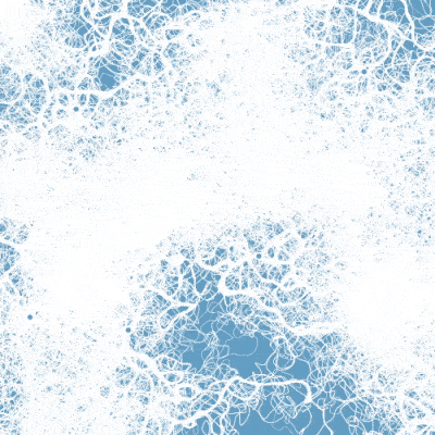
I ended up writing multiple kinds of output: several types of raster output, and one in vector. To capture raster output, I tracked which cells the ants had visited, and how often. By tinkering with filters on this output, you could get a ghostly trace of where the ants had been.
The raster output was attractive, but I wanted the individual paths to be clearer, so I also explored exporting as svg. For the vector output, I stored a history for each ant, and when they reached either home or the nest, saved that history to a list. To render, I sampled each saved path and drew it as a series of curves.

Connecting the dots
I knew I wanted to draw the ants traveling between many points, so one of the first things I wrote was code to composite multiple simulations into a single image. But then, what to draw?
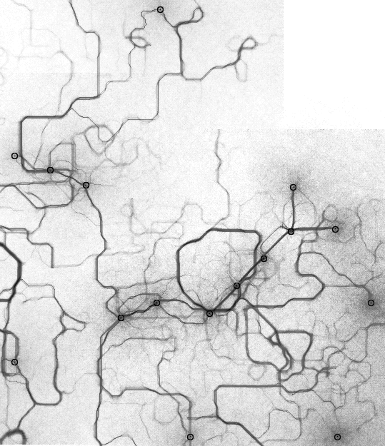
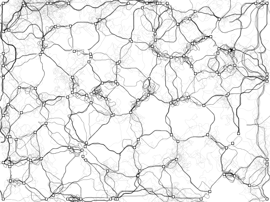
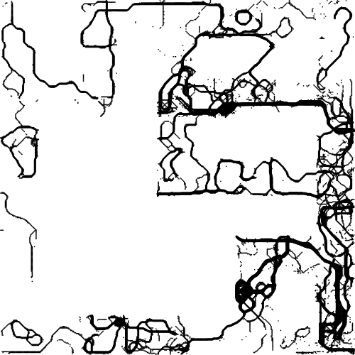
My first idea was to represent some very literal graphs: starting simple, with binary trees, and then moving on to more complex visualizations. It seemed a natural fit, given that ant colony optimization is used to solve pathing problems in graphs. I also thought it would be an interesting way to visualize complexity in code: why not take a UML diagram or dependency graph, and render it with ants?
I was already familiar with Graphviz, so I decided to use that suite of tools and the DOT graphing language to lay out nodes and edges for my simulation. Graphviz has a mode that will output a DOT file annotated with pixel locations. I wrote a very ugly DOT file parser and used that, with my annotated DOT file, to simulate the locations of my ant nests and food.
My experiments with binary trees seemed promising, and had a very natural, organic quality to them.
Next, I started to build bigger graphs, using a few different codebases as input. I wrote a few simple python scripts: one that turned a git tree into a DOT file, and another that turned C import dependencies into a DOT file.
While both of these were interesting – and certainly complex – I was disappointed that neither really said anything about the overall form of the codebases they were built from. The more I experimented with code visualization, the more I realized that building an interesting graph from a codebase was really its own, bigger problem. However, I did like the complexity of the very large graphs, and came back to that later.
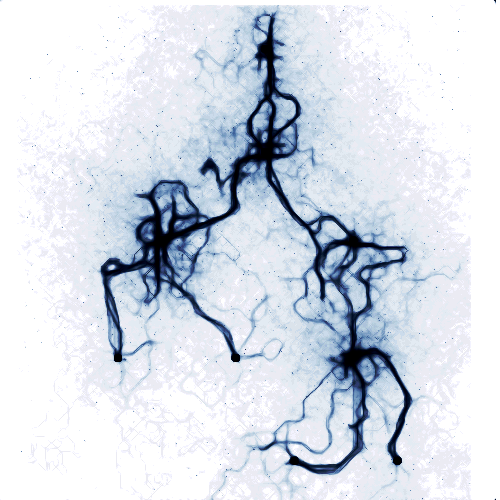
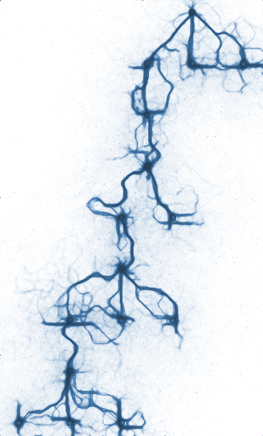
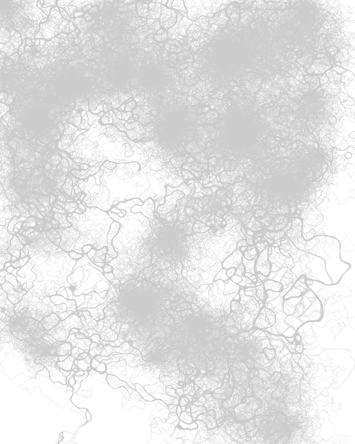
My next experiment was to play with simple forms. I plotted lines, circles, sine waves, and other shapes that were easy to describe with nodes and edges.
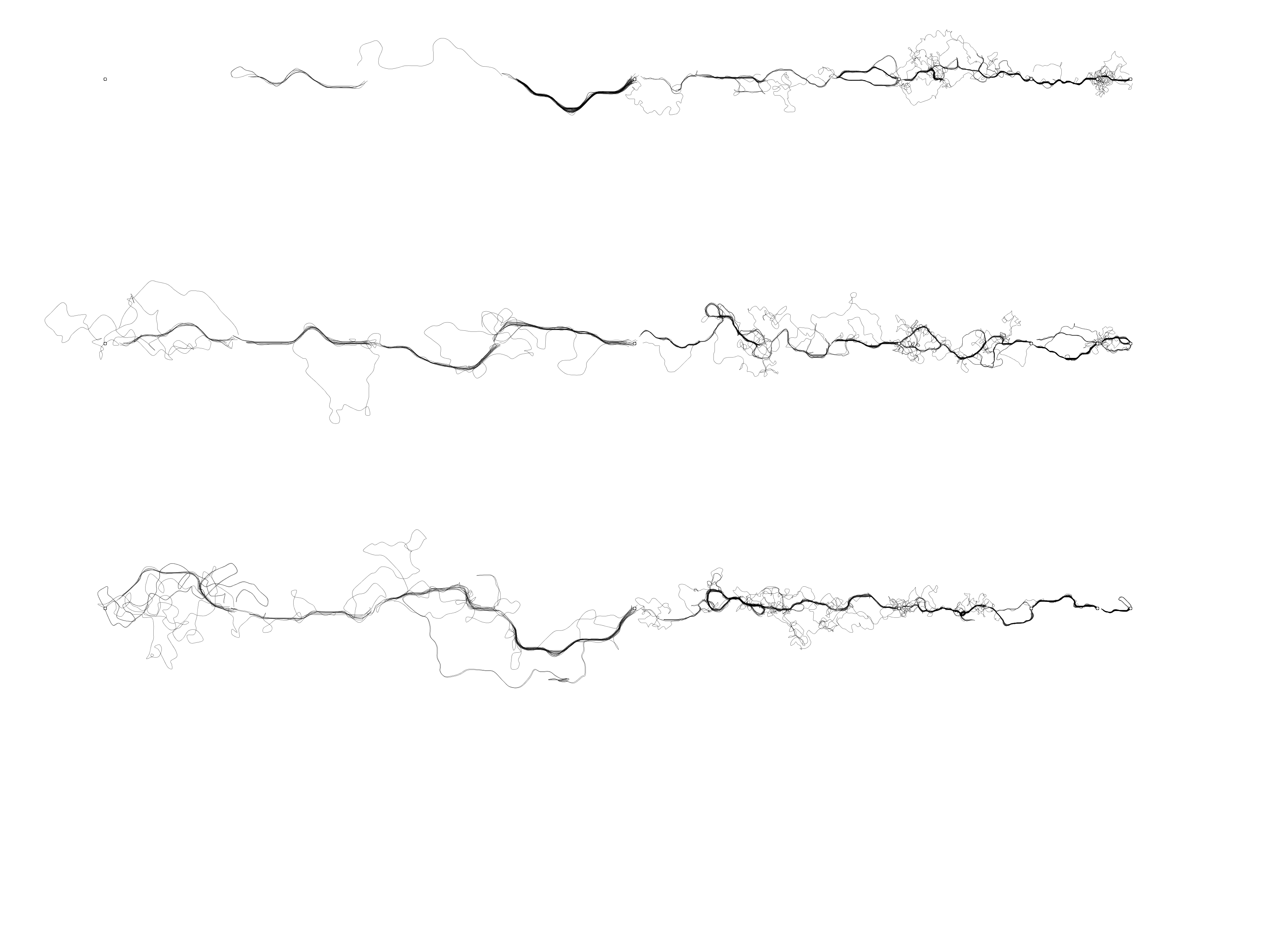
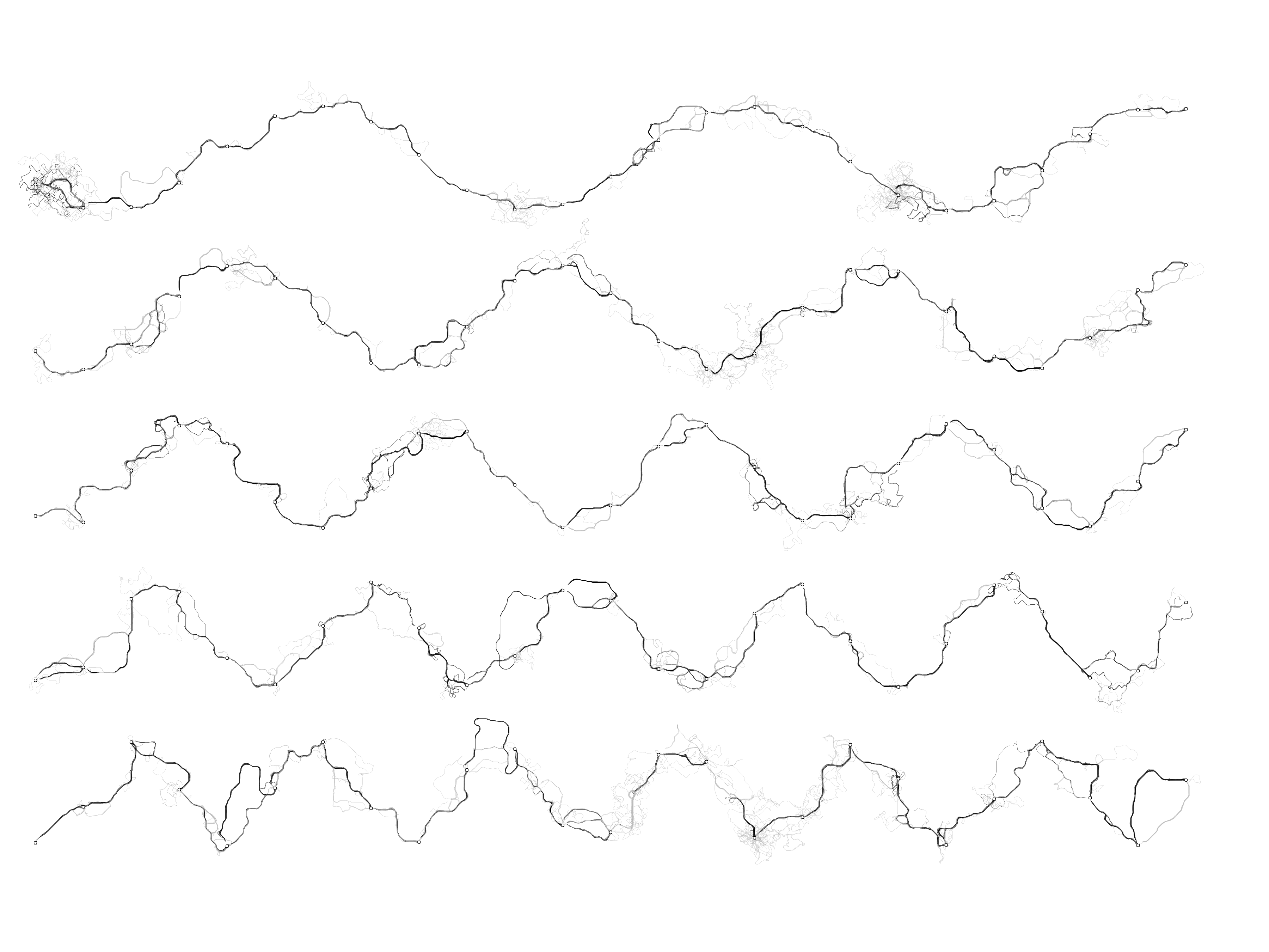
What I found most interesting were simple triangulated spaces. I generated a set of well-distributed points – either randomly, or by drawing shapes – and then used a Processing library to turn those points into a Delaunay triagulation or a Voronoi diagram. I used the resulting edges for the ant simulation, with each edge representing one ‘nest’ and one ‘food’.
This led to a nice, full space of complicated ant squiggles, which did a better job representing the complexity I was interested in.
Finally, I went on one other tangent. A friend took a look at the simulation, and asked what would happen if the ants hit a wall – could they route around simple obstacles? I already handled walls as an edge case, so I added interior walls, and then spend a lot of time trying to coax the ants to solve mazes.
I had a vision where the ants would solve a simple maze, and I would stitch them together into a larger piece of work. I spent a lot of time trying to adjust the simulation variables so that the ants could solve it, but I never was never able to get them to solve it consistently. Ultimately, it just ended up being ant-path squiggles bounded by the shape of the maze itself.
The completed art
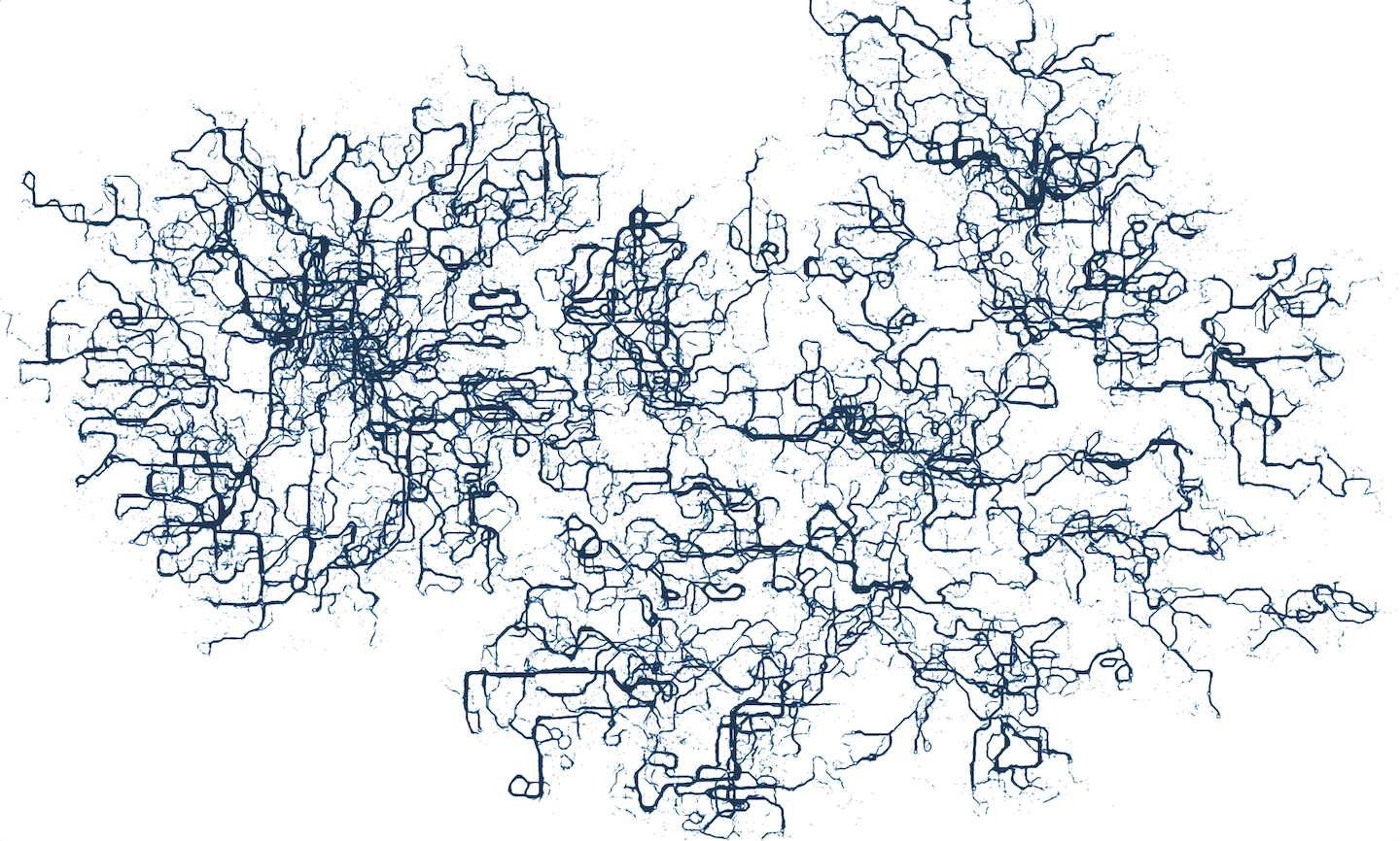
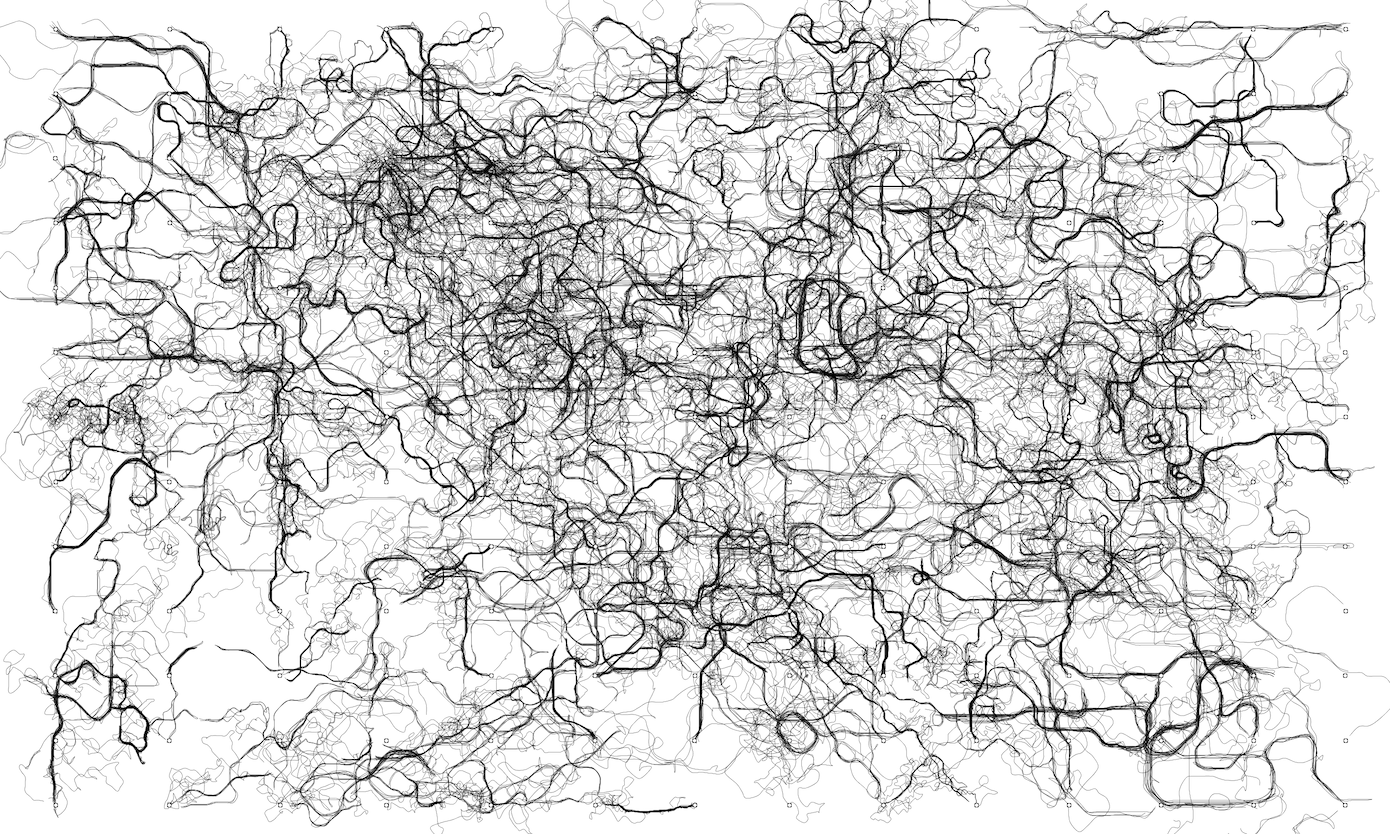
At this point, I took a step back and looked at the output from all of the different experiments. I realized that the most interesting images had been from the large fields of semi-random points and edges. I decided to make that my final approach, and set up the simulation to draw lines between a Delaunay triangulation of random points.
The final problem was then how to turn my SVG squiggles into a finished piece. I knew from some experiments that I wanted to sort the paths – somehow – so I could emphasize the paths that had nice shapes. But the final simulation took an hour or two to run, which made tinkering with variables for each run an impractical way to experiment.
What I decided to do was write a second Processing program, which would load the simulation’s SVG output, and then apply the visual effects I wanted. Even better, I could make the post-processing script interactive, so I could experiment with different line weights, colors, and sorting thresholds.
I tried out a few separate ways of scoring which paths should be in the foreground, and which should be in the background. I calculated a few different factors: how many times each line intersected itself; how many times the line crossed over its slope line; and how likely each was to follow the slope predicted by the previous two points.
I used the post-processing script to experiment with different weights and values for these scores, until I landed on an appearance I was happy with.
I found it very helpful at this point to save one image for each variable change. As I got closer to an image I was happier with, it was much easier to compare a film strip of slight variations, than to change multiple things at once.
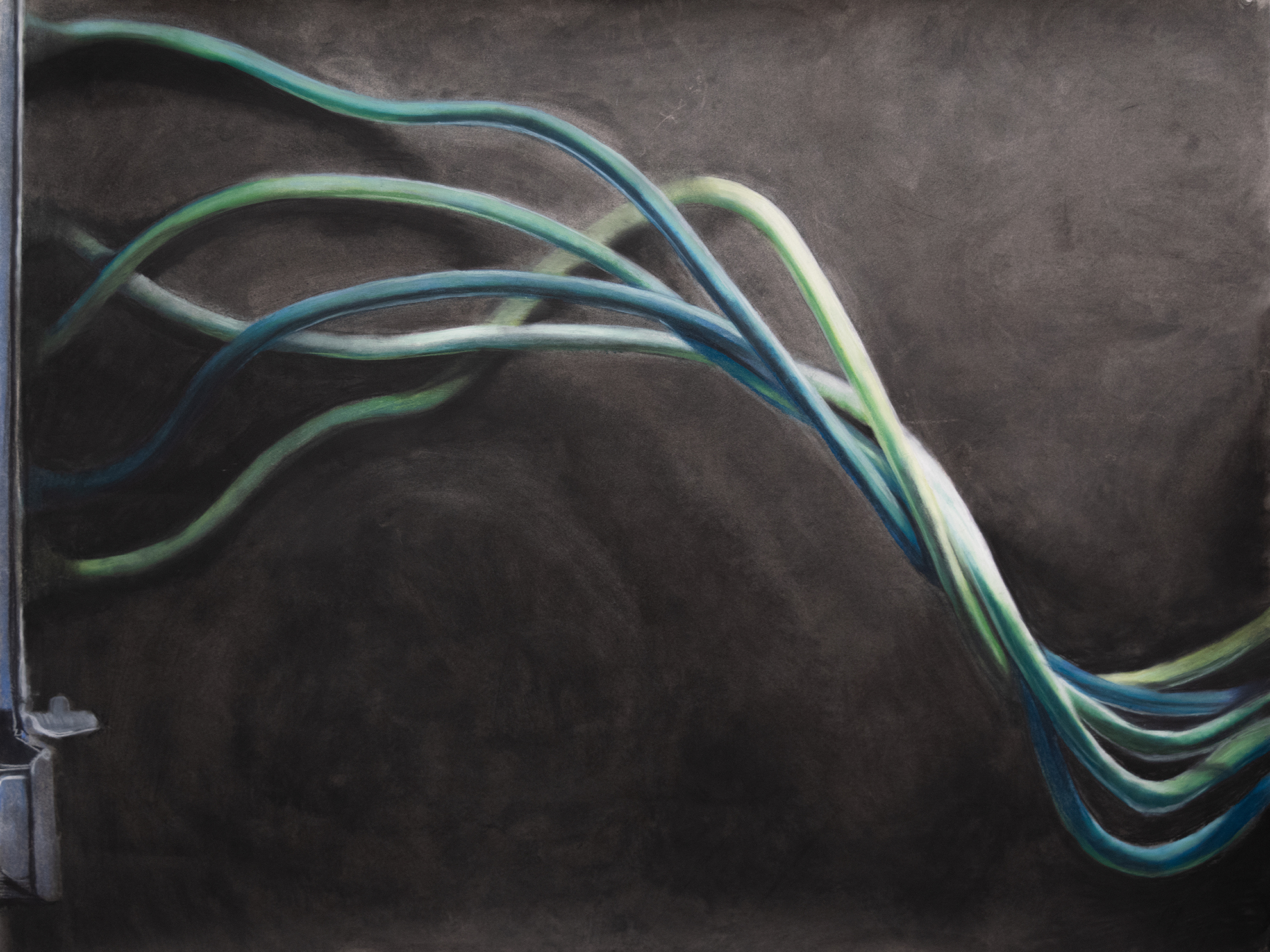
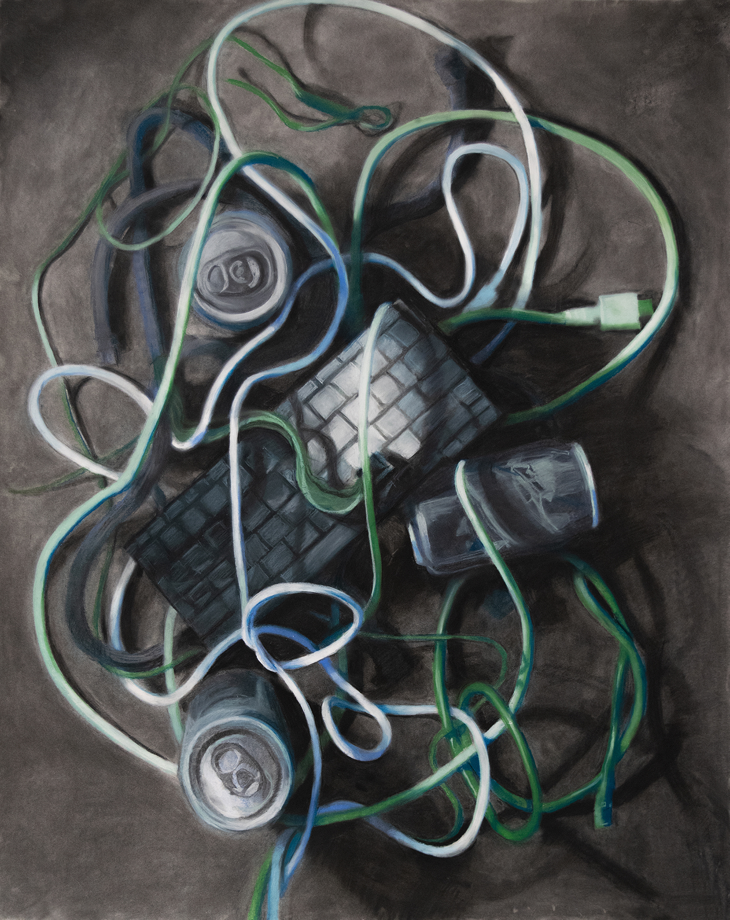
After a lot of tinkering and slight adjustments, I created this image from my simulation:
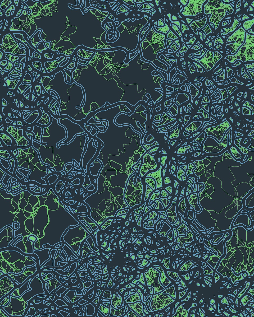
I zoomed in on an area I thought was particularly interesting, and cropped to create a good balance between open and filled space.
The last, and final step, is deciding how to turn this image into a physical artifact. So far I’ve printed it digitally, as a 16×20″ poster, and made a (failed) attempt at screen printing it on colored paper. The digitally printed poster looks great, but next I want to try copying the image as a part of painting. I find complex drawings sort of meditative, and I think I could do some interesting things rendering it by hand.
This project took much longer than I expected, and became more complex than I imagined. But it was a great way to experiment with all sorts of interesting computational geometry and algorithmic problems. I think there’s some irony that I wrote a few thousand lines of code for a work about complexity, but I’m happy that the work looks cool and can speak for itself.